In Praise of Illustrators and Cover Designers

I am not done gushing over the beauty and wonder that is the cover of THE WAR ON ALL FRONTS but I wanted to spend some time with the cover of MAN UP, my debut that released in April, 2020.

Again, Erica Weisz from Trism Books designed it. She had asked me for images, themes, and anything that stood out about the book that might help her design the cover. I don’t remember much of what I told her but I know whatever I said did nothing to contribute to the cover we ended up going with.
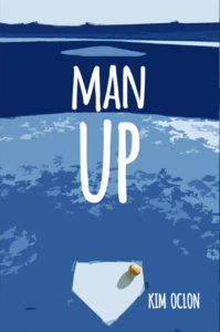
As you can tell from both covers, Erica does a lot with very little. MAN UP’s cover is pretty much a view of a baseball diamond from behind homeplate that seems go on and on into the distance. The first design was more realistic with green grass and brown sand but it was the baseball that stood out to me. Erica has always utilized mixed media and I LOVED how it was a real baseball on this drawn field. And then she, somehow, decided to make the cover two tone blue instead of using more natural tones and I was blown away. Why was it blue? I’m not sure but WOW! And still, that real little baseball was on homeplate. There’s even a shadow. Again, the shadow that is doing so much.

I have no idea how Erica took my jumble of words to create the cover she did for MAN UP and then did it again for THE WAR ON ALL FRONTS. I’m not gifted in the visual arts. Thank goodness for the talented people who are.

THE WAR ON ALL FRONTS Has a Cover!

Isn’t it beautiful?

Authors like to geek out about their covers. Allow me to do so now:

• The army green: In the original version the words were all in black. The use of army green is awesome.
• The notebook paper with the confetti edges: Sam and Anthony can only communicate via letters while Anthony is fighting in the Vietnam War. It is such a big part of the story and I love it.
• The stick figures. The two boy stick figures. Their little stick heads bent toward one another, holding their little stick hands. One figure even has a flat top and a duffel bag. I almost cried when I first saw these guys. They’re perfect.
• The shadows. I have no idea what to make of the shadow of my two little stick guys but it adds something. I might have my English teacher hat on a bit too tightly here, but I imagine the shadow is cast because of a sunset. A day is ending with something new beginning and neither of the little stick guys know what’s in store. I know what’s in store, and I’m not going to lie little stick guys, it’s going to be rough.

Erica Weisz at Trism Books is an amazing illustrator and artist. She asked me what images and themes came to mind when I thought about the book and she took those phrases to come up with this incredible cover.

Please cross all your fingers and toes and hope that we can welcome this book into the world in a more traditional way come May 7th and you can see this book on a shelf in person.